Brand Identity • Naming • Website Design • Brand Collateral
34 Parallel Construction
INDUSTRY: Construction
Grounded in Adelaide with solid foundations.
34 Parallel Construction came to us as Adelaide’s newest construction company, with a clear ambition: to enter the market with confidence and credibility, while standing apart from the sea of traditional luxury builders. The brand needed to feel modern, high-end, and unmistakably professional.
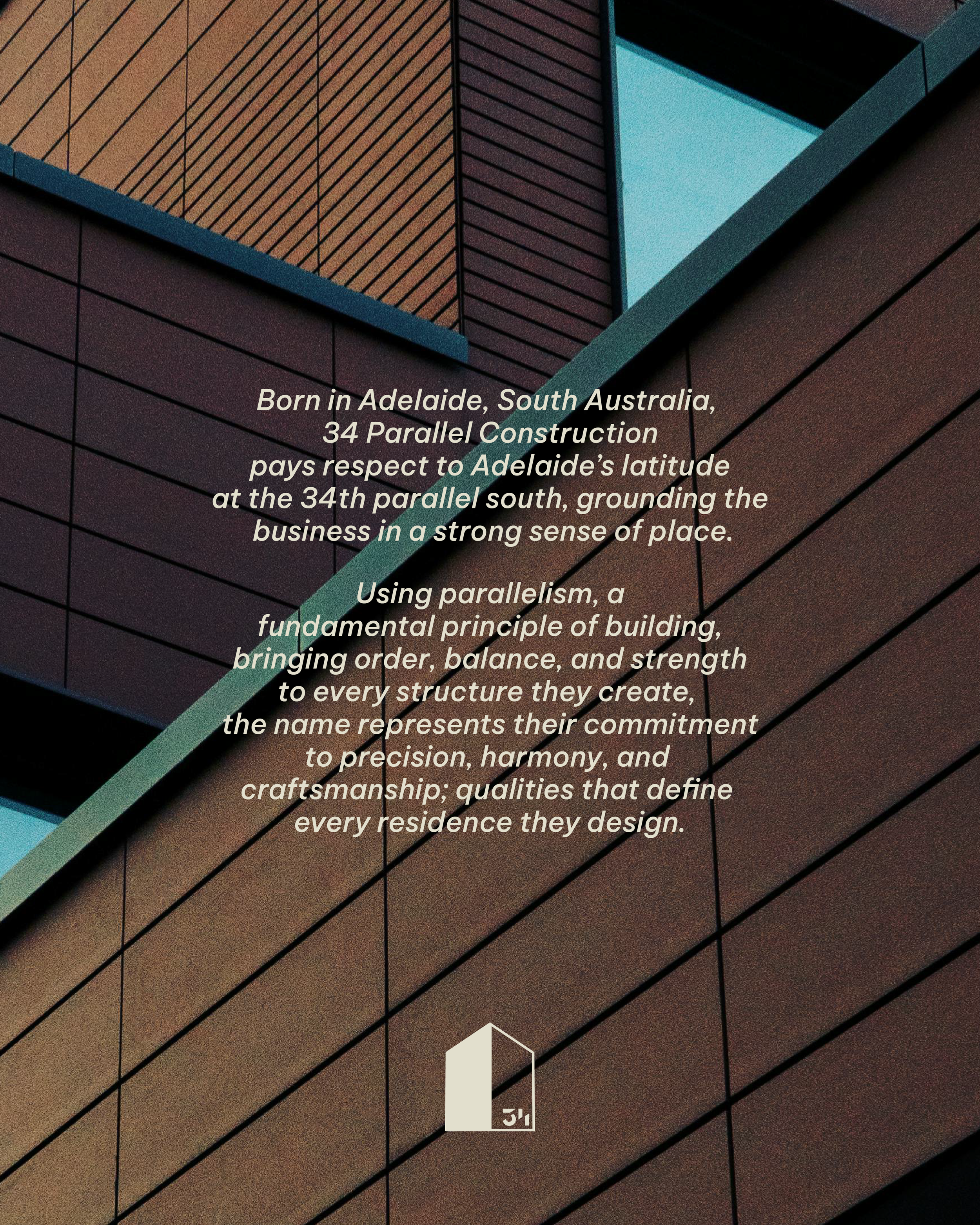
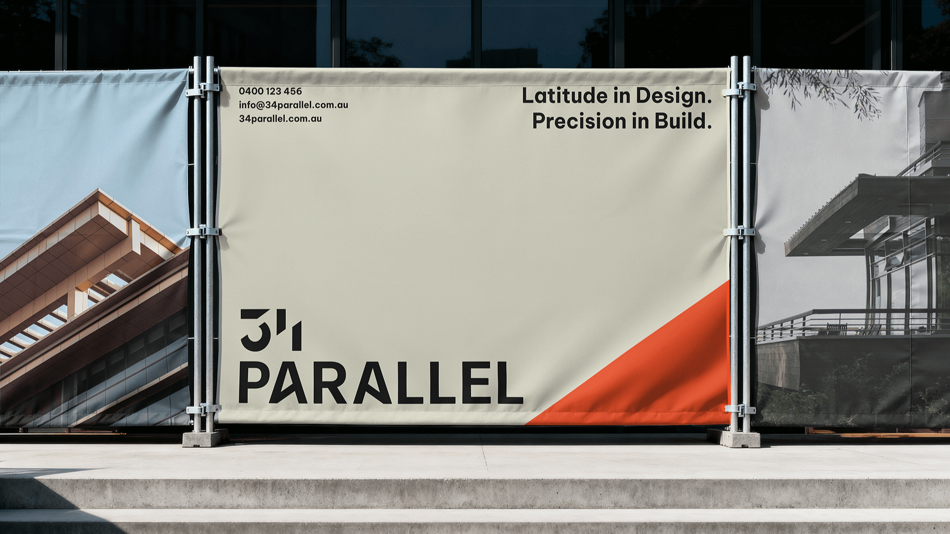
We began with the name. 34 Parallel references Adelaide’s latitude at 34° south, anchoring the business in a strong sense of place and paying homage to its South Australian roots. It also reflects a fundamental principle of construction: parallel lines create order, balance, and strength. A fitting metaphor for a brand built on precision, harmony, and craftsmanship.
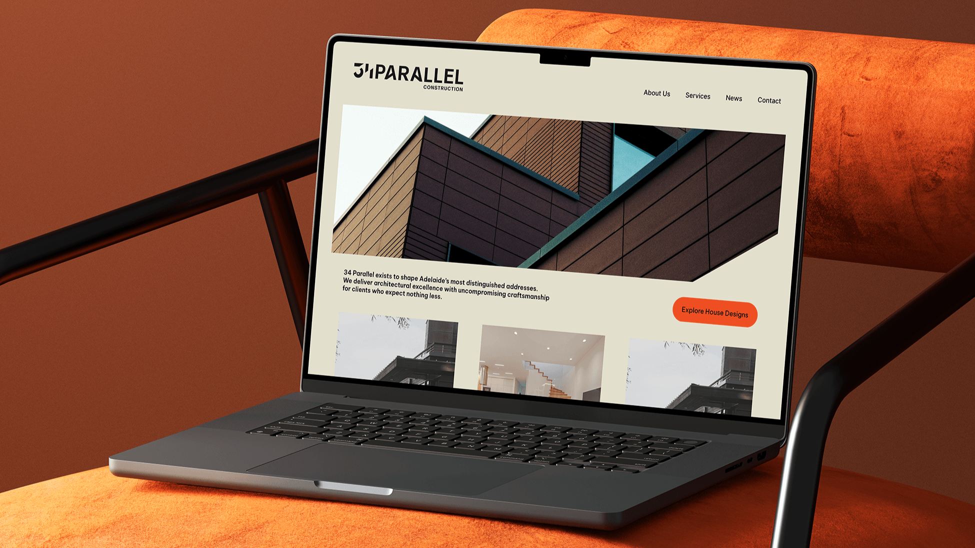
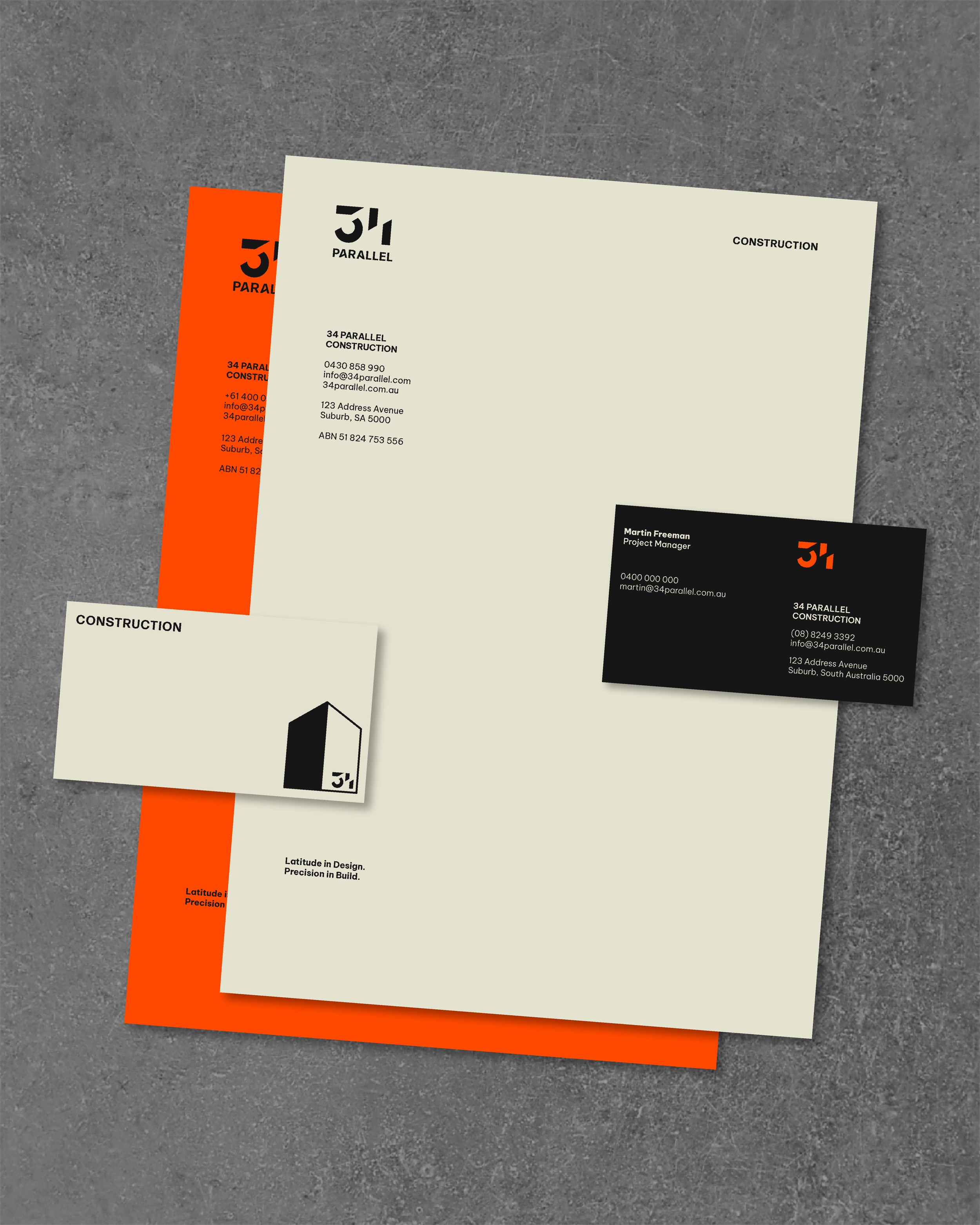
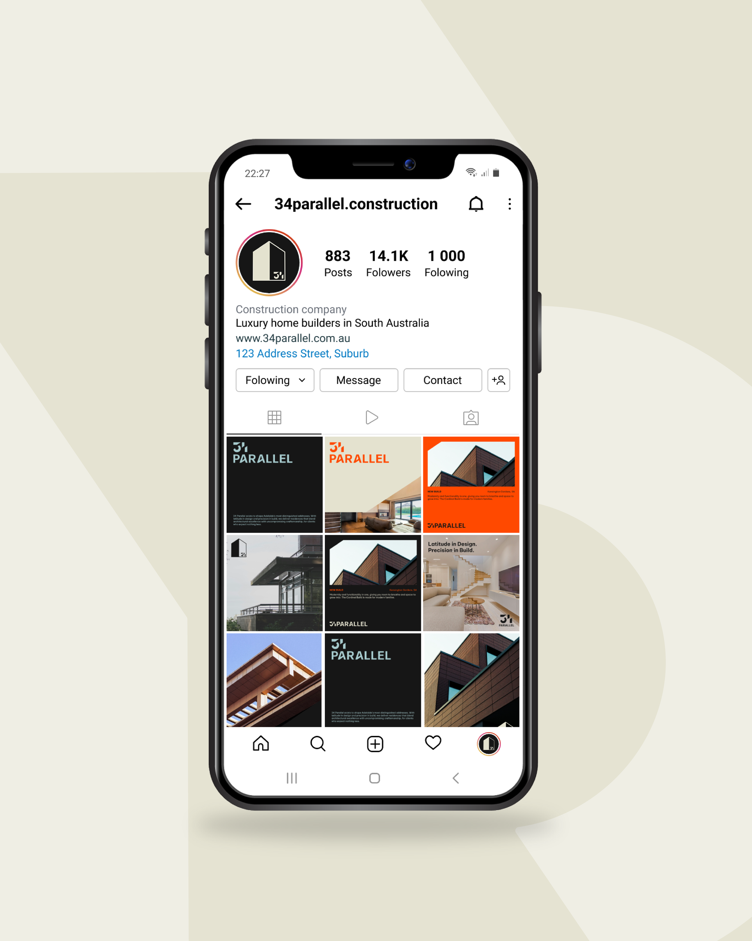
Visually, we leaned into minimalist design to communicate clarity and confidence, while introducing a bold, contemporary colour to modernise the brand and set it apart from the predictable gold-and-black palette common in luxury construction. The result is a refined identity that feels premium without being pretentious.
We extended the brand across a considered digital and physical rollout, including website design, social media templates, hoarding, and poster collateral. Every touchpoint was designed to integrate seamlessly into the existing construction landscape, while giving 34 Parallel a strong, independent presence.
The outcome is a polished, future-focused brand that positions 34 Parallel Construction as a serious new player in Adelaide’s building industry, grounded in place, defined by precision, and built to last.